VKontakte redesign: expert opinions for and against. New design of VKontakte Video catalog and new entries for iPhone
Write about the new design? Well finally!
!!! Attention!!! In general, I immediately warn you that I evaluate design not only as a user, but also as a designer (including those related to the web) and I will write a lot not only about the design itself, but also about why there are so many dissatisfied. And there will be many letters!
About why everything is so unusual:
As soon as the new design with limited beta testing became available on April 1 (because of which everyone doubted the seriousness of the update), I immediately went to the VK blog and connected. After that, he began to jump through all the sections and see what and how there. On the first day, I found about five bugs, which I immediately sent to the administration for correction. They didn’t fix only one that is considered logical (the fact that you can’t send an image to a friend, for example, from a community or a feed and then save it to an album. The logic is that they say they sent it themselves, so why save), but this thing was in the past design.
After that, I posted in my community with a summary of the redesign and a vote. It became interesting how the first users will react. Most complained about not being able to find some functionality, such as a toggle switch in messages (which is easy to find if you hover the mouse over the edge of the dialog box). Yes, such interface elements are very unusual against the background of everything that has been in RuNet lately. But this is not a problem with the new design. This is the problem of the design thinking that has been formed in Runet in recent years. We very rarely make progressive and good (!) design that becomes more convenient and evolves smoothly and evenly, allowing the user to get used to new elements that are more intuitive and correct in terms of UX (user experience is that part of interface design that is responsible for accessibility user and convenience). Instead, we have sharp jumps in the most progressive developers, which cause a wave of misunderstanding on the part of users. And all this against the backdrop of a huge number of sites with a terrible design, which is inconvenient but just plain familiar. And all because sites are usually made either cheaply or according to the principle "that's how they need it." Those who have the potential and can create progress simply do not work for the money that is offered in RuNet, and go to do good and expensive work for foreign guys. This is all very sad, and that is why the introduction of a new VK design resembles the baptism of Russia. But after a while, users will get used to it, remember where something has changed and understand that everything is not so bad.
About the fact that "mow under Facebook, well, at least the feed without other people's likes!".
The fact is that design is evolving and so far it is considered optimal, which is also called the design of forms and content. It was developed not so long ago by Google and many have picked it up.
Everything in it is based on proportional elements and accents, which makes it very simple and understandable in the skillful hands of the developer. Here are all these panels with a profile leaving from the left in applications, for example, - that's all it is.
Let's remember how the same phones looked 10-15 years ago. Each Nokia model was something completely new: all these slide-out panels, screens that fold out in all directions, the craziest keyboard layouts - it was all very cool. At the same time, I don’t remember complaints about a lack of understanding of new products, because everything was so new, interesting and cool!
But with progress, everything came down to a simple plate with a button on top and two on the side (or three on the back like LGE). Now the product is either like someone else's, or new and not understandable. Now there is no point in reinventing the wheel, especially if it is less convenient than the one that already exists. It's just that now the design of devices and interfaces, web design have come to an optimum and it is becoming increasingly difficult to do better. Large manufacturers are not so stupid that they copy from each other, they are so literate that they accept the rules that determine convenience, and they finally came to a common concept.
The same goes for social media design. Developers are the last thing they want to be told they stole the design. No. No one will judge you if you make a chair like thousands of other chairs. Ikea does just that: they make painfully banal, but simple and good things. Then what is the problem with web design?
Now here is my subjective "think" about the newest VK:
Got better. Here's the truth. The old version has changed so little that it already looks more like the old thematic forums from the 2000s than a modern social network. Now mobile version and applications began to have a lot in common with the site. It's wonderful. There is a logical connection between them. In the communities, these ugly multi-story avatars disappeared for half a page with "Subscribe" and so on. Now you can check alerts with a click without leaving the page, it's just likes and replies, not a graph for a separate contemplation. Photos with answers now complement each other when opened, and do not go down to infinity.
About messages: I communicate a lot on VK (5-20 dialogues a day) and this new format makes me very happy. Those who are not satisfied can easily switch to the old format by clicking on the gear at the bottom of the screen and changing the settings. Everyone should be happy, right?
At the same time I agree
Everything is bad
I rate this redesign as unprofessional: too many important features of the site were made worse than they were, and the little things that complemented and made the site different were removed or turned into trash.
It was worth introducing the redesign gradually
A lot of work has been done, and this is understandable: they restarted everything at once, which is basically wrong. It would be better to update the site in parts, as Facebook does. After all, the user needs to be prepared for the new, to test new things in parts and then gradually launch them based on feedback.
Blue coffin nailed to the top
A fixed header can be made this way if it contains important content. Now in it, except for the search and the icon of audio recordings, there is nothing, a solid fixed coffin that distracts.
The news page has become narrower and more cluttered
The photo began to open like on Facebook

Top 5 less noticeable flaws
Implicit to the eyes, but explicit to the brain. Here are the key ones.
- Icons-pictograms in the menu
- Pale gray background that took away the cleanliness old version
- The left column in the profile is fixed when scrolling and does not allow expanding the news to the entire width of the valid content (as it was in the old version)
- The new logo does not fit into the header and creates even more empty space
- My activity indicator (online) in my own profile! This is the edge of logic! Not only is there a text indicator next to my profile name, but now there is also a green circle
The most annoying for users

Is it really that bad? Alternative expert opinion
Viktor Kozyrev
UX designer at Frog Design, Badoo and Cogniance; creator of the Spender app
“Perhaps, many expect more radical and aggressive design steps from large companies, but, in my opinion, VKontakte took a pragmatic path and solved specific problems. A new visual style is striking, which has definitely become more modern and pleasant. Navigation has also been redesigned and simplified. Now everything looks more concise and is perceived easier. The typography is neat, clean, and contrasty, making for a comfortable experience for most users.
The font "VKontakte" that the user sees depends on its version operating system and browser (iOS users will see San Francisco fonts, and Android users will see Roboto). Due to the use of system fonts, the user gets an almost familiar and due to this unobtrusive, comfortable look-and-feel product.
You should be prepared for the fact that the majority of the audience will be indignant in any case, regardless of the nature of the changes. This is understandable: the average user cannot always immediately assess the potential benefits of changes. But the discomfort from the loss of familiar amenities is felt immediately. Not because the old solutions are so good, but because people are used to it. This is explained by psychology. Most of the audience will be annoyed by the very fact of the redesign in principle. And the reason can be any detail that will hook the most: someone will notice the difference in the font or icons, and someone will find fault with the new navigation.
I personally am not a fan of the three-column layout and would try to simplify it to make the pages easier to read. In particular, this applies to the user profile. The page seems to be overloaded, visually homogeneous, lacking properly placed visual accents. Despite the greater number of similar solutions, VKontakte still looks cleaner and more modern, and the interface is perceived easier.
If you still want to return the old VKontakte design, then download the Stylish browser extension. After installing it, you need to open the style page for the old social network design, click the "Install with Stylish" button, confirm the choice of the new style and restart the browser.
- I'm not kidding. Since the transition to such an interface is obviously inevitable for everyone, the question is, how to return the old design of Vkontakte has only a temporary solution. But since albeit temporarily, disable the new Vkontakte design and it is still possible to continue working with the usual sane interface, then we will do this.
This question is relevant, perhaps, for all Vkontakte users who have become accustomed for 10 years to the simplicity and convenience of the old design and use its functionality to the fullest. In particular, this applies to those who created and administer communities and groups - the developers of the new VK.com, of course, made life difficult for them with their innovations.
By the way, for this category of VK users, I would like to give a practical recommendation: in order not to waste precious time on self-promotion of the public both on Vkontakte and on all other popular social networks, and fully concentrate on high-quality content for your community, you should contact the service social like. Judging by the numerous positive reviews, this PR team knows their business and will be able to quickly provide your group with the right number quality subscribers.
Let's return to the main question. Immediately make a reservation - we will talk about browser version social network. Android and iOS applications, alas, will not be considered in this article.
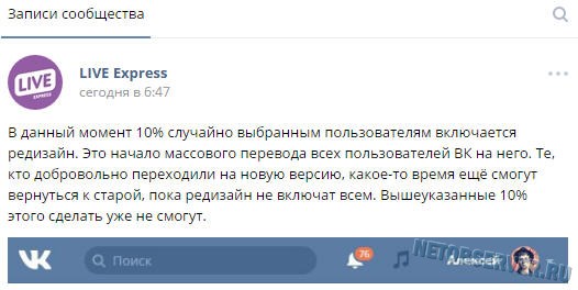
Upd. 08/17/2016. Dear Reader, in order not to waste your precious time, I would like to immediately inform you: "The uprising is suppressed, Skynet has won." Well, jokes aside, the inevitable happened: despite all the protest moods of Vkontakte users, the developers, after several “waves” of transferring users to the new design, decided that it was enough to waste time on trifles: on August 17, 2016, ALL users of the social network were transferred to the new design ... Accordingly, the new addresses .vk.com simply does not exist at the moment, and recommendations using its return do not work ...
This does not mean that there are no ways to return the old Vkontakte design now: especially for those who do not give up, we suggest that you familiarize yourself with the ““ block located below in the text. There you will find a way that will probably be able to extinguish the flame of righteous anger in you.
Well, before this block, information will be given that is more of historical than practical significance: the following is a chronology of the fight against the disease called " New design Vk.com". Familiarization with this information will take you, dear Readers, not so much time, and it will probably be interesting for someone to know “how it all began”, so all previously workable methods remained in the article. So let's start.
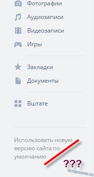
For those who have become a “guinea pig” for Vkontakte designers involuntarily (that is, they just encountered a new interface at some point), there should be a link “Return to the old version ...”, located at the bottom of the left column with a menu and advertising. In truth, the designers clearly tried to make the tool for how to return the old version of Vkontakte as invisible as possible: gray letters on a gray background - it's hard to notice.
Those who voluntarily joined the “ranks of testers” of the new interface (by clicking on the ill-fated “Join testing” button) may not find links to return to the old version.
And how to disable the new Vkontakte design in this case?
Pay attention to the address bar of the browser:
 Attention to the address bar!
 As you can see, before vk.com added “ new". Those. in fact, it's a different user profile page. To return the usual vk.com/id_page, and with it to return the old version of Vkontakte, we simply “correct” the address: you need to erase “ new.". And, of course, press Enter (or the input confirmation key on a touch device).
The following result will come out:
 Removed “new.” from the address, got what you need!
 Familiar? Probably painfully 🙂. Yes, yes, this is the good old vk.com interface, which everyone has gotten used to over the 10 years of its existence. Well, now the matter is small: all that remains is to bookmark this page in the browser so as not to edit the address each time, and call this page after authorization on the social network.
It is not yet known exactly when the redesign of Vkontakte will “cover” everyone, so there is hope that the old version of vk.com will be used for a long time.
Upd. 06/09/2016. It seems that the Old Believers did not rejoice for long: the VK.com team began a forced transfer to a new design without the ability to return to the previous version.
Upd. No. 2 - joyful (not so joyful anymore - has lost its relevance ...)
It turns out that there is still a workable method to return the old Vkontakte interface, even to those who, it seems, were left with no options (at least for this method in VK they repeatedly thanked the “prompter”). However, we warn you right away - you will have to perform all actions at your own peril and risk, and the risk may be present. The return method of the old vk.com design is related to running scripts, and Netobserver does not guarantee that there is no code in the body of the script that can steal user login and password.
Let's consider a really working method suitable for Google browser Chrome and its "brothers", like Yandex.Browser (browsers based on the Chromium platform):
So, the method is as follows: we find it on the Google Playmarket

Install the first plugin in the list:

After installation, the activity of the plugin can be checked by the icon in the upper right corner of the browser:

In the tab that opens, click on the "Install this script" button: 
Next, a warning from Tampermonkey will appear that you should only run reliable scripts (i.e. once again warns - you act at your own peril and risk), and the installed script is displayed:

That's all - the script immediately starts its work. You just have to go to Vkontakte (or refresh the page if you are already there), and make sure that the good old vk.com is back!
Moreover, the effect will be preserved when switching between the elements of the Vkontakte menu, and upon re-entry.
This is more convenient than the method that was proposed in the comments to this article (however, I would like to say “Thank you” for this option for resolving the issue “How to return the old Vkontakte design”).
There are also Tampermonkey extensions for other browsers:
- For Ognelis: ;
- for Opera: ;
- at Safari - .
Well, after installing the extension for your browser, you return to the step with downloading the userscript - and then in order 🙂.
Upd. 3 - for the most stubborn.
Dear readers, you have 2 options: accept and start getting used to the new design (this is difficult, but possible - I say from my own experience), or fight to the end 🙂 . The remaining way to fight is to use custom styles. Now there are several of them being developed, and all of them are still very raw. But, as they say, on lack of fish and ...
For enthusiasts who do not give up and are ready to "get confused", we have prepared the following recommendations:
- Application of a user script through Tampermonkey;
- Using the Stylish Browser Plugin with Style Loading(most popular option) .
For those who have already learned how to work with Tampermonkey (see the description in Upd.2- above in the text), an alternative script is proposed (though very crude), returning some kind of old version. Applying it for now, perhaps, makes little sense, but you can track the changes being made - I'm sure that after a while this user style will work much better.
https://userstyles.org/styles/userjs/128986/%D0%A1%D1%82%D0%B0%D1%80%D1%8B%D0%B9%20%D0%B4%D0%B8%D0 %B7%D0%B0%D0%B9%D0%BD%20%D0%92%D0%9A.user.js
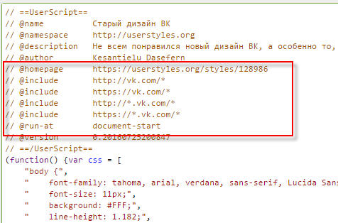
The script will need to be edited. Specifically, the following lines are of interest (from 7 to 10):
// @include http://new.vk.com/*
// @include https://new.vk.com/*
// @include http://*.new.vk.com/*
// @include https://*.new.vk.com/*
You need to remove "new." on lines 7 and 8, ".new" on lines 9 and 10.
It should turn out like this:
The Stylish plugin is the most publicized version of the return of the old Vkontakte design
In principle, Stylish's algorithm is similar to Tampermonkey's, with the only difference being that Stylish, unlike the latter, works with styles, not scripts.
Warning: Do not run Tampermonkey with Stylish! Although both plugins are designed to do, in principle, the same thing, it’s not a fact that using them together will lead to twice the best result (rather a fact that it won’t 🙂).
So, if you have already tested the first method and decided to move on to the second, first deactivate the Tampermonkey plugin.
What should the user do first? Of course, download the plug-in suitable for his browser. Links below:
After installing the extension, you need to make sure that it is activated. For Chrome, the picture will be as follows: an icon with the letter “S” will appear in the upper right corner of the browser:

The next step is to download the style from the developer's site: .
On the page that opens, you will need to use the big green button - it's hard to miss it:


Judging by the speed of releases, the author is trying very hard to eliminate all the shortcomings that are currently available. Therefore, I recommend that you bookmark this page so that after a few days (weeks) you can download the modified style for Vkontakte, which will no longer be so raw.
In the meantime, let everything be the same for you as the lucky one who left such a review:

Dear readers, if you have alternative methods for reverting to the old Vkontakte design, feel free to leave them in the comments! We are also waiting for the feedback of those who were helped by the above recommendations.
Good mood to you all!
Article How to return the old Vkontakte design - disable the new version was modified on May 4th, 2017 by the author netobserver
The topic of this article is the new design of VKontakte. Changed again, now you can set a horizontal cover in a group. Making your VK community with such a header is much more interesting. Frankly, no Photoshop knowledge is required here. Can be done without special skills beautiful picture even in PowerPoint, Fotor, Canva, Pixlr Editor.
Going to the group, you will notice that in those groups the buttons “Pinned entry”, “Information” and “Press menu” have become visible. Before, they were hidden. Naturally, all the design of the groups immediately went.
Downloading a new cover
And now let's figure out how to enable the ability to set a horizontal header. Let's click on the "Manage" button.


Then we click on the last one, and upload a new cover of the VKontakte group. This is where you can understand that the download file can be of any size! But no less than 1590×400 px. We create a cover prototype in any editor. Next, we can select and save the area that meets the requirements of the VC. Here's a hint on where to find the cover image, which editor to use to
What is interesting about the new design of VKontakte?
The main thing: there is more space for information. Now here you can write the name of the group, the purpose of its creation, a call to action, and so on. This design will be logically complete and more functional. But you can leave the old design, it's a matter of taste for everyone.
When you design a horizontal cover, you will notice that the internal menu now somehow falls out of the general context. I think it would be better to pin the picture to go to the menu. And use it to host wiki pages in a group.
At the same time, I would like the developers to add some other possibility for setting a beautiful transition to the Wiki page.
I would like to note that since 2016, the developers of the social network Vkontakte have been actively trying to set up this network to promote business. Make it more business friendly. From my point of view, this is very good and very much in demand among many Internet entrepreneurs.
But most importantly, in my opinion, they need to carefully consider the “Bans” system so that entrepreneurs can work calmly without interfering with those users who come to have fun on the social network.
How to make a Vkontakte group cover online
Turn on your creativity and choose what you like the horizontal cover or the already familiar Vkontakte design. Creating online and installing a new cover is visually, step by step, presented in the video below the article.
P.S. I hope this information is useful to you.
P.S.S. Turn on your creativity and good luck in all your endeavors!
Congratulations, Dear Readers!
Besides, today is Friday. It's time for "". On the agenda we have a circumstance discussed by all major publications, which I also had to face. It's not so much about the redesign of the VKontakte social network, which is under testing, but about fun facts about this topic.
View screenshots new version site can link .
User reaction
Everything here is very ambiguous: from enthusiasm and applause, to exclamations that VKontakte is becoming more and more like Facebook.
My personal opinion: global changes did not happen. The screen width has slightly increased, the familiar design has become more modern. No more.
How to enable the new VKontakte design
As mentioned above, the new design is under testing.
It is reported that now everyone can turn it on for their account. To do this, scroll to the end and click on the "Join testing" button.
I should note that not everyone is allowed to test. On an account that was seen running groups and advertising, I received an invitation to test a new design from a respectable old man. On the other account, whose activity is limited to listening to audio recordings and chatting with a dozen friends, there was no such invitation. Moreover, an attempt to join testing has not yet been successful:
Your application is accepted.
We will notify you as soon as the redesign becomes available.
About the venerable old man
It is difficult not to mention who came to replace Pavel Durov. Yes Yes. There is not a word about Pavel in the new version of the design.

Do you have a minute to talk about the new design of VKontakte?
Meet Harold (aka Morris). This character, as it turned out, is the hero of Internet memes. To my shame (or honor) I learned about it for the first time. In general, we met. It was his hand-drawn image that "provoked" the transition to a new design.
Video revealing the essence of the meme, from Agnia Ogonyok:
In conclusion
In addition to the fact that the personality of Harold was a great discovery for me, I did not understand why exactly he acted as the face of this "advertising campaign". Probably, the material was not fully studied by me. So please forgive me.
That's all. I wish you a good weekend.
